Aesthetic Neon Wallpaper: How Can You Choose The Perfect Design?
Aesthetic neon wallpaper can make a phone, tablet, or computer feel instantly more personal, but the strongest design is not simply the brightest one. Color balance, negative space, resolution, icon visibility, and screen layout all affect the result. The guide explains this better.

Key Takeaways
- Neon wallpapers combine luminous colors, dark backgrounds, glow effects, and digital artwork to create a bold visual identity without requiring every part of the screen to be bright.
- For iPhone and other icon-heavy interfaces, composition matters as much as color. Negative space around clocks, widgets, and app icons helps the wallpaper remain usable.
- Complementary, analogous, and monochromatic palettes can all work, but one dominant hue and one or two supporting accents usually produce a cleaner neon result than equal-intensity colors everywhere.
- Neon aesthetics remain relevant in 2026 through cyberpunk, Y2K, gaming, synthwave, anime-inspired art, and more restrained modern designs that use glow as an accent rather than a full-screen effect.
Table of contents
-
What Is Aesthetic Neon Wallpaper?
-
How Can You Choose An Aesthetic Neon Wallpaper For Iphone?
-
Which Aesthetic Neon Wallpaper Style Matches Your Personality?
-
How Do Neon Colors Influence The Look And Feel Of A Wallpaper?
-
Which Color Combinations Work Best For Aesthetic Neon Wallpapers?
-
What Makes A Color Look Truly Neon?
-
Are Aesthetic Neon Wallpapers Still Trending?
-
How Can You Get The Best Experience With Aesthetic Neon Wallpapers?
What Is Aesthetic Neon Wallpaper?
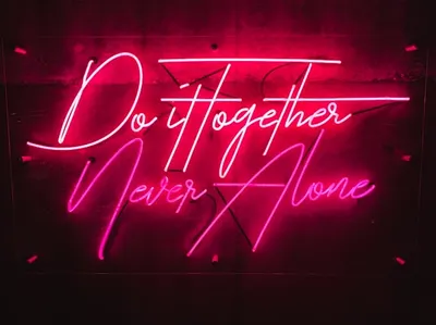
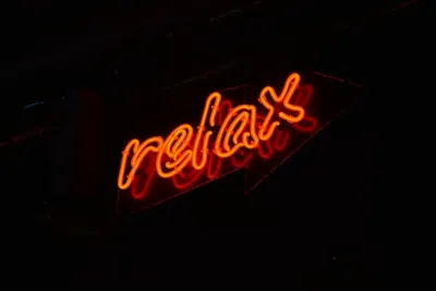
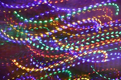
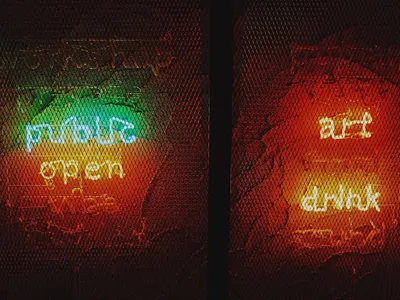
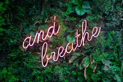
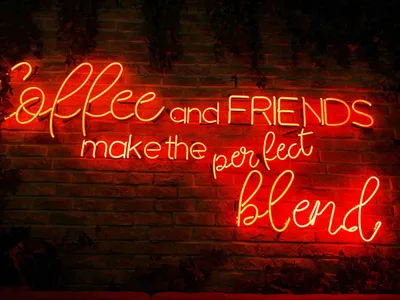
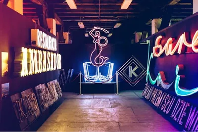
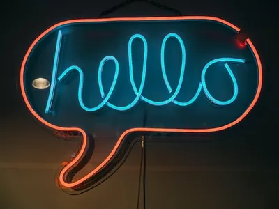
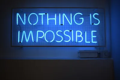
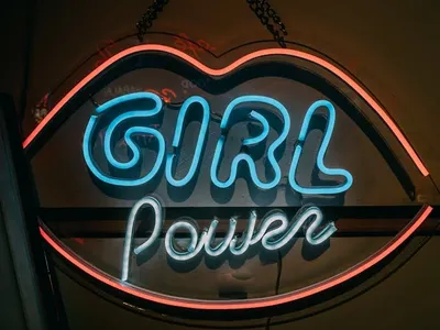
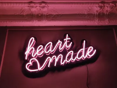
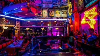
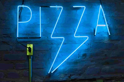
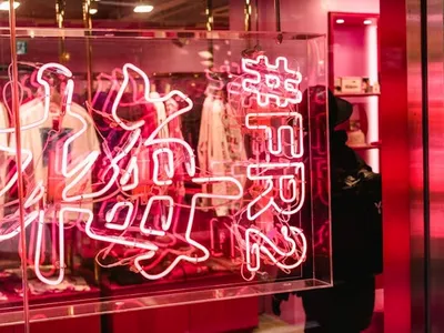
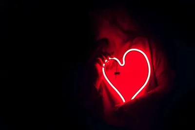
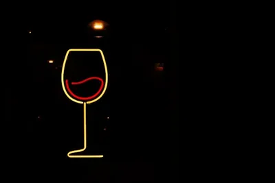
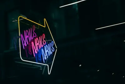
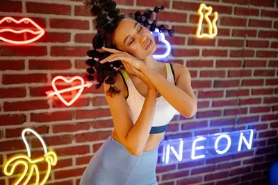
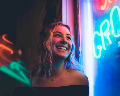
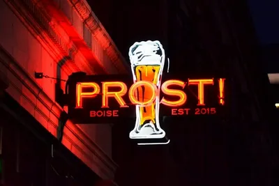
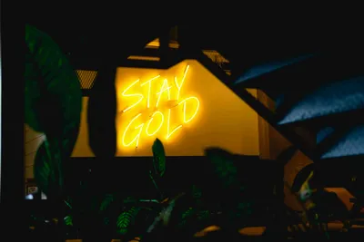
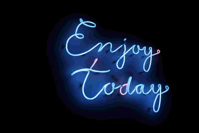
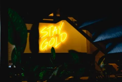
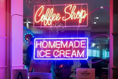
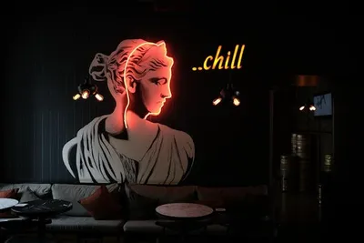
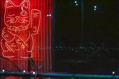
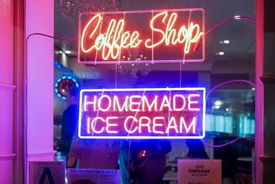
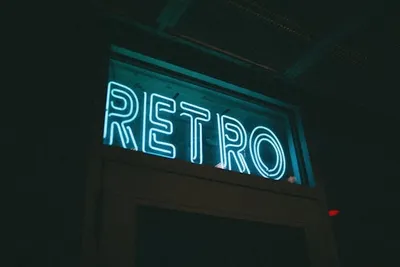
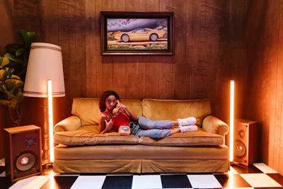
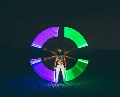
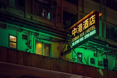
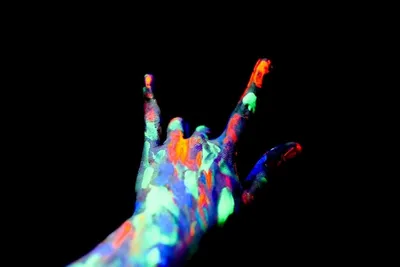
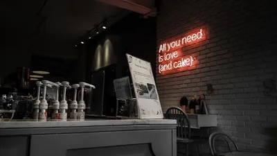
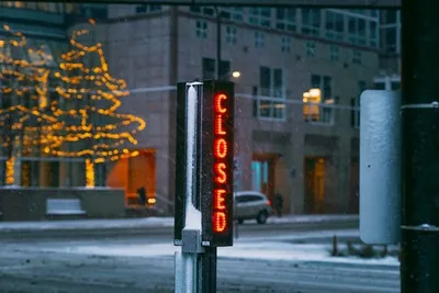
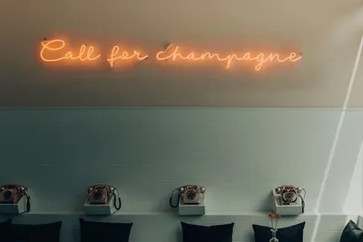
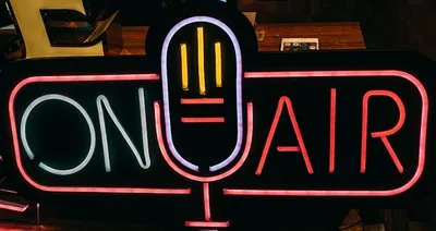
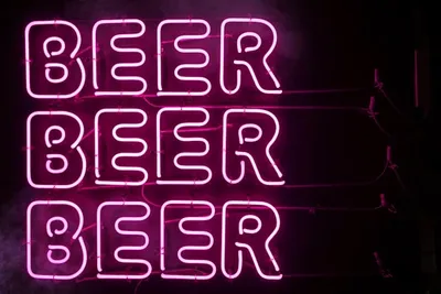
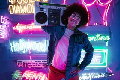
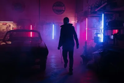
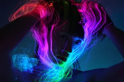
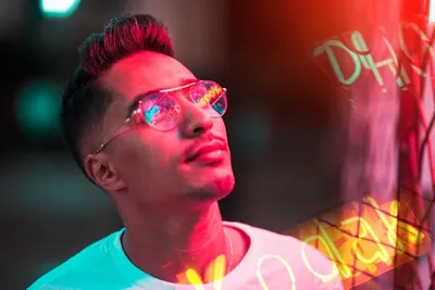
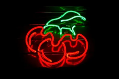
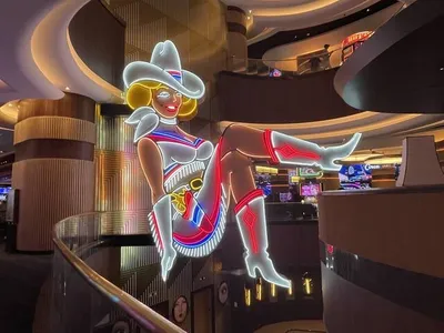
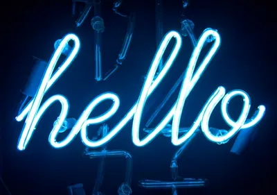
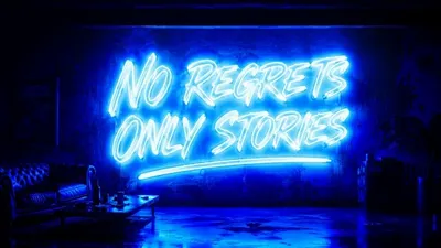
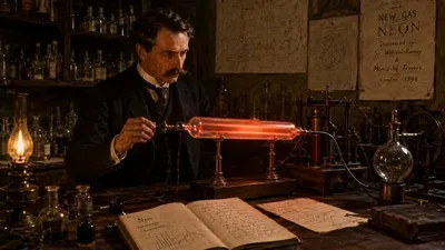
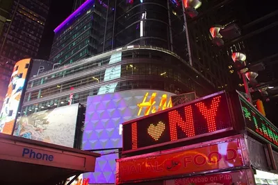
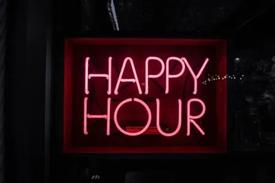
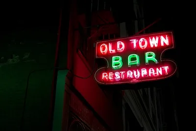
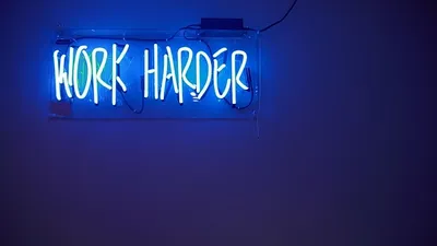
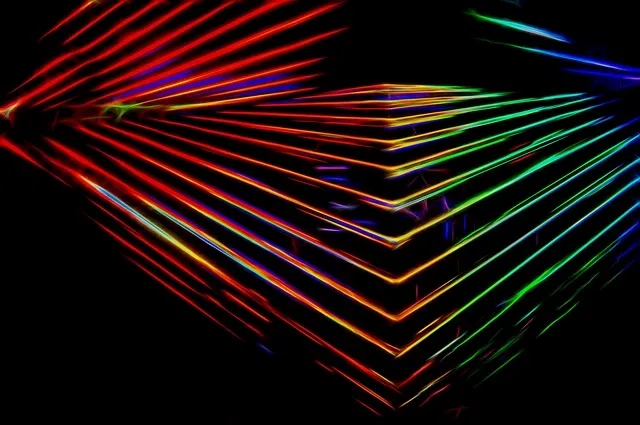
Aesthetic neon wallpaper is a digital background that uses bright, luminous-looking color against darker or quieter areas to imitate the visual energy of neon lighting. The glow may come from photographed signs, illustrated tubes, colored gradients, bloom effects, reflections, or digitally rendered light. On a screen, the effect is simulated with pixels rather than gas-filled glass, but the design language can still feel convincingly luminous.
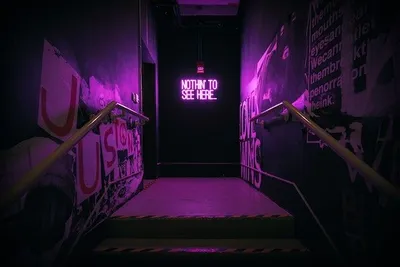
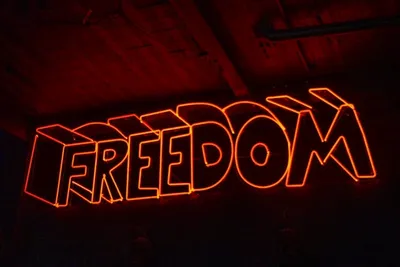
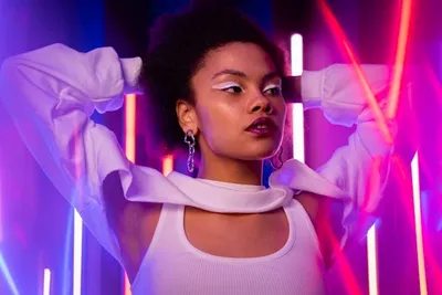
The appeal comes from contrast. Electric pink, cyan, violet, green, orange, or red appear more intense beside black, navy, charcoal, or deep purple. That contrast can make a phone feel cinematic or futuristic, while larger desktop backgrounds have room for city scenes, typography, characters, geometry, and reflected light.
What Types Of Aesthetic Neon Wallpaper Are Available?
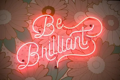
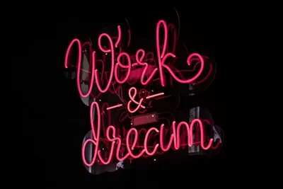
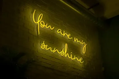
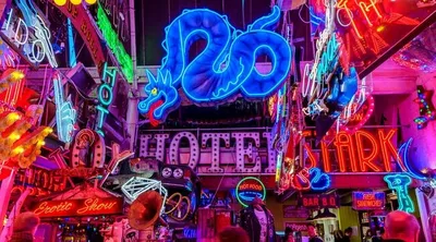
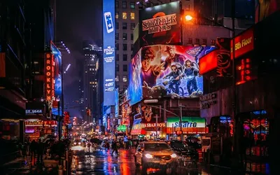
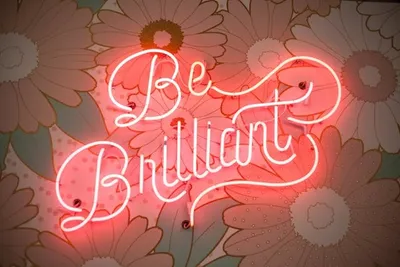
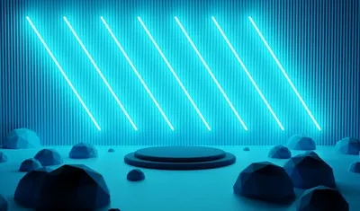
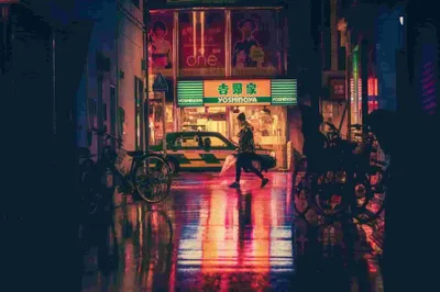
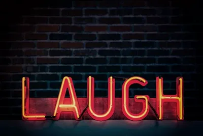
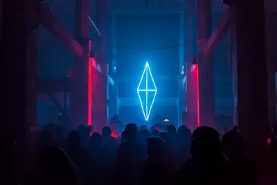
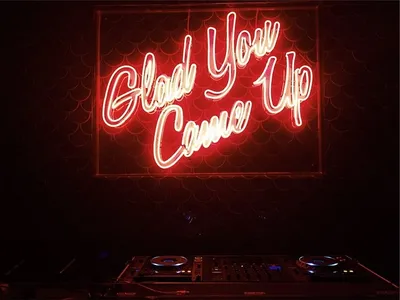
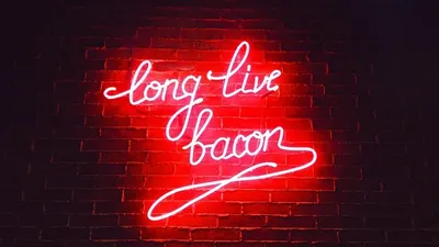
Popular categories include cyberpunk cityscapes, glowing typography, neon landscapes, retro grids, vaporwave sunsets, geometric patterns, anime-inspired illustrations, gaming artwork, photographed signs, and abstract gradients. Each category handles light differently. A cyberpunk scene often uses multiple light sources and deep shadows, while minimalist typography may rely on one bright phrase and generous empty space.
Photographic wallpapers feel grounded because light interacts with real streets, haze, glass, and metal. Illustrated and 3D-rendered designs can push saturation and impossible environments further. Animated backgrounds add movement but may compete with icons and widgets, so choose the format that supports how you actually use the device.
How Can You Choose An Aesthetic Neon Wallpaper For Iphone?
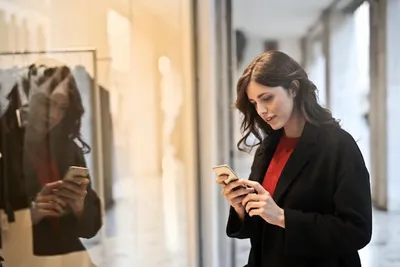
An iPhone wallpaper has to coexist with the clock, controls, notifications, widgets, and app icons. Apple lets users create separate Lock Screen and Home Screen treatments, so the same image does not have to perform both jobs. The Apple wallpaper customization guide explains how photos, styles, widgets, and separate Home Screen customization can be combined. That flexibility is useful when a dramatic Lock Screen becomes too busy behind everyday apps.
Start with the correct portrait orientation and enough resolution for your model. Avoid stretching a small image because neon edges reveal softness quickly. Check where the brightest elements sit. Intense lettering or light trails can collide with widgets and icons, while darker negative space gives the interface room to breathe.
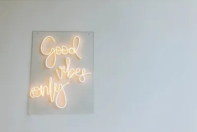
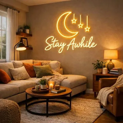
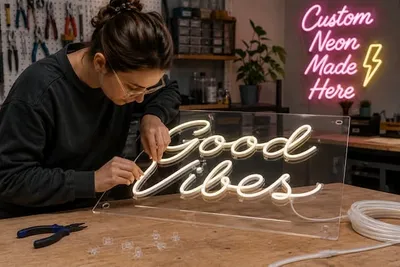
If you enjoy the same glow beyond the screen, custom aesthetic neon signs can translate a favorite color mood, phrase, symbol, or artwork into a physical LED feature. The useful design lesson is the same in both formats: decide what deserves attention first, then let the surrounding space support it rather than compete with it.
What Makes An Aesthetic Neon Wallpaper Ideal For Iphone?
A strong iPhone wallpaper leaves clear visual zones for the clock, Dynamic Island area on compatible models, Lock Screen widgets, and Home Screen icons. The subject does not need to be perfectly centered. In fact, an off-center figure or light source can work better when it creates clean space where interface elements appear.
Preview the image on both screens before committing. Check whether clock text disappears into a bright glow, labels become hard to scan, or widgets obscure the focal point. If necessary, crop differently, reduce saturation, darken part of the image, or reserve the artwork for the Lock Screen.
Want the neon aesthetic on your wall as well as your screen?
Create custom aesthetic neon signs with your preferred colors, artwork, wording, and dimensions for a real illuminated focal point inspired by the same visual language.
Which Aesthetic Neon Wallpaper Style Matches Your Personality?
Style is personal, but describe the mood you want rather than searching only for neon. Cute designs may use hearts, clouds, butterflies, and pink or lavender light. Dramatic versions favor black, cyan, purple, chrome, or futuristic architecture. Retro styles lean into diner signs, grids, sunsets, arcades, and Y2K nostalgia.
| Style | Visual character | Works well for |
|---|---|---|
| Cute / playful | Pink, lavender, hearts, stars, soft glow | Casual personal screens |
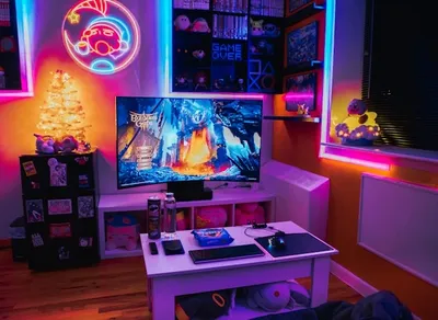
| Cyberpunk / futuristic | Cyan, magenta, violet, dark city imagery | Gaming and tech setups |
| Retro / synthwave | Sunsets, grids, arcade colors, bold typography | Nostalgic visual themes |
| Minimalist neon | One line, symbol, or phrase with negative space | Icon-heavy home screens |
| Branded / creative | Logo-inspired colors, custom typography, motifs | Studios and content workspaces |
Should You Choose Cute Or Cool Neon Wallpapers?
Neither category is automatically better. Cute designs usually feel warmer, friendlier, and more decorative, while darker cyberpunk or gaming designs feel sharper and more immersive. The practical difference is often density. Playful wallpapers can become cluttered when every sticker, star, and glow competes at once. Dramatic designs can become equally tiring when every edge is high contrast.
Match intensity to the interface theme. A dark-mode phone can support stronger cyan, pink, or violet accents because black and charcoal areas blend naturally with menus and icons. A lighter interface may work better with pastel neon gradients or a restrained accent. If the wallpaper is for a content studio or branded desktop, a physical companion such as a custom logo neon sign can extend the same palette into the background of photos or video.
Turn a wallpaper idea into a real illuminated design
Use our custom neon sign service to transform a phrase, sketch, or visual concept into a personalized LED neon piece for your room, studio, or business.
Design yoursHow Do Neon Colors Influence The Look And Feel Of A Wallpaper?
Color changes the character of a composition, but color psychology is a design cue rather than a universal rule. Associations vary by culture, context, and personal experience. Pink and purple can feel playful or nightlife-inspired, blue and cyan often read as cool or technological, while red and orange can feel warmer and more energetic.
Adobe's color psychology overview makes a useful point: color associations can guide design, but they are not an exact science. For wallpaper, brightness and saturation often matter as much as hue. A pale blue haze feels very different from a fully saturated electric blue edge, even though both belong to the same broad color family.
How Can You Keep Neon Wallpapers Vibrant Without Becoming Distracting?
Use brightness selectively. Keep large portions darker or less saturated and reserve the strongest glow for the focal area. If the screen feels noisy, reduce the number of competing colors first. One dominant neon hue, one supporting hue, and a neutral dark background often feel richer than several equally intense colors.
Readability should remain part of the decision. W3C contrast guidance is written for web content rather than wallpapers, but the principle transfers well: foreground information becomes difficult to read when the background offers insufficient contrast. On a phone, test the actual clock, labels, widgets, and notifications instead of judging the image alone.
Which Color Combinations Work Best For Aesthetic Neon Wallpapers?
A useful starting point is color harmony. The Adobe color wheel tool can generate complementary, analogous, triadic, and monochromatic palettes from a base hue. Complementary colors create stronger opposition, analogous colors create smoother transitions, and monochromatic palettes build depth from one color family. Neon wallpaper can use any of these approaches, provided the hierarchy remains clear.
For a cyberpunk look, magenta and cyan against navy or black remain effective. Purple with electric blue creates a cooler atmosphere. Neon green with deep violet feels more experimental, while hot pink with orange can create a warmer Y2K mood. A monochromatic blue palette can feel futuristic without becoming as aggressive as a three-color composition.
Which Neon Color Combinations Create The Strongest Visual Impact?
- Magenta + cyan + near-black: classic cyberpunk contrast with clear separation between warm and cool accents.
- Purple + electric blue + navy: immersive, cooler, and easier to keep cohesive across a large screen.
- Hot pink + orange + deep plum: warmer Y2K, nightlife, or retro-pop energy.
- Neon green + violet + charcoal: high-impact gaming or digital-tech mood.
- Single-color cyan or pink + black: minimalist neon with strong icon readability when negative space is preserved.
Treat one color as dominant and the others as accents. Equal areas of fully saturated magenta, cyan, green, and orange can flatten the hierarchy because everything demands attention. Dark neutrals are not wasted space; they are what allow simulated glow to look brighter. They also provide practical zones for app icons and interface text.
Need a branded neon look for a desk, studio, or content setup?
Create custom logo neon signs that reproduce your brand mark in vivid LED light for offices, streaming spaces, retail displays, and promotional backdrops.
What Makes A Color Look Truly Neon?
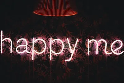
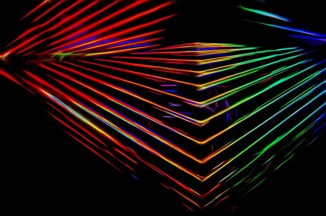
On a digital screen, a color looks neon when the design suggests emitted light. High saturation helps, but saturation alone is not enough. Designers often combine a bright core color with a softer halo, blurred bloom, reflected light, and a much darker surrounding area. The eye interprets the difference between the bright center and the dark environment as glow.
The screen is not producing physical neon in the traditional sense. It is reproducing red, green, and blue light through pixels and using contrast to simulate luminous tubing, haze, or reflections. This is why the same hex color can look vivid on black and surprisingly ordinary on white. Context changes the perceived intensity.
Why Can't Some Colors Produce A True Neon Effect?
Some color names depend on low brightness or low saturation, which conflicts with fluorescent glow. Brown is the clearest example: increase its brightness enough and it begins to read as orange, amber, or yellow instead of 'neon brown.' Muted beige, grey, and dusty pastels have similar limits because their identity depends on restraint.
You can still create a glowing design around those colors by using a brighter related hue for the light source and keeping the muted tone in the background, shadows, or surrounding artwork. That approach protects the original palette while giving the composition the luminous contrast associated with neon.
Prefer a modern LED interpretation of the glow?
Choose custom LED signs with flexible illuminated tubing and acrylic backing to build a bright, lightweight design around your own artwork or message.
See LED optionsAre Aesthetic Neon Wallpapers Still Trending?
Yes, but the look is broader than the older idea of filling an entire screen with glowing pink and blue. Figma 2026 design trends highlights the return of vibrant, saturated palettes, Y2K nostalgia, high-contrast pairings, and neon gradients in contemporary digital design. That supports the continued relevance of neon wallpaper, especially where users want a strong visual identity.
The aesthetic persists because it overlaps with several communities. Gaming and streaming favor high-contrast lighting, cyberpunk uses neon as futuristic city language, vaporwave and synthwave connect glow with digital nostalgia, anime art often borrows night-city lighting, and Y2K design uses chrome, hot pink, blue, lime, and glossy effects.
Which Neon Wallpaper Trends Are Most Popular Today?
Cyberpunk, Y2K, vaporwave, synthwave, anime city scenes, futuristic gradients, chrome typography, retro arcade imagery, and minimalist single-line glow remain recognizable directions. In 2026, a particularly useful update is restraint: instead of making every object luminous, many contemporary compositions use one bright accent, a controlled gradient, or a small glowing subject against a sophisticated dark field.
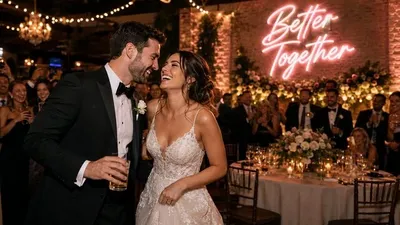
That restraint also translates well into physical decor. custom LED neon signs can reproduce a focused phrase, outline, or artwork without copying every detail of a complex wallpaper. If you want the screen and room to feel connected, repeat the dominant hue or motif rather than attempting to duplicate the whole composition.
How Can You Get The Best Experience With Aesthetic Neon Wallpapers?
Choose the wallpaper for the real screen, not the thumbnail. Download a legitimate high-resolution file, match the aspect ratio, and crop deliberately. Then use the device normally. If icons become harder to find, the clock disappears into highlights, or the brightness feels tiring at night, edit the image rather than abandoning the style.
If a digital design inspires a room feature, a custom neon sign service offers a way to reuse the wording, palette, or motif in physical form. Keep the connection simple. A wallpaper with a cyan-magenta city does not require a complex city-shaped sign; one phrase or symbol in the same color family may create a stronger, more flexible result.
What Should You Consider Before Setting A Neon Wallpaper?
- Use an image resolution appropriate for the device and avoid enlarging a small file until the glow edges become soft or pixelated.
- Check the image license before downloading or redistributing artwork, especially when the design includes characters, logos, photography, or commissioned illustrations.
- Preview the wallpaper with the real clock, widgets, app icons, desktop shortcuts, and dark or light interface theme.
- Keep important faces, lettering, and focal details away from areas likely to be cropped, blurred, dimmed, or covered by interface elements.
- Revisit the wallpaper periodically. A design that looks impressive in a gallery may become visually tiring when viewed dozens of times every day.
Frequently Asked Questions About ''aesthetic Neon Wallpaper''
What Is The Most Aesthetic Neon Wallpaper?
The most aesthetic option fits your preferred mood while preserving usability. A dark background with one or two vivid accents often works well because it creates a strong glow without overwhelming icons. Choose a style you will enjoy repeatedly, not only the most dramatic image in a wallpaper gallery.
How Do You Choose The Perfect Aesthetic Neon Wallpaper For Your Iphone?
Choose a high-resolution portrait image, preview it on both Lock Screen and Home Screen, and check how the clock, widgets, notifications, and app icons overlap it. Favor darker negative space around interface elements, then adjust the crop or use separate wallpapers if one image cannot provide both visual impact and readability.