Neon Dark Purple Aesthetic: How Can You Create A Moody, Electric Look?
The neon dark purple aesthetic depends as much on darkness as on the purple itself. Strip out the deep background and the electric violet stops reading as electric. This guide covers the palette, the wallpapers, the signs and the interface work, and how to keep all four consistent, rather than merely purple.


Key Takeaways
- Neon dark purple pairs deep shadowy backgrounds with vibrant electric violet, ultraviolet and magenta illumination.
- Midnight black, charcoal and deep indigo establish the foundation, while glowing strips, signs and laser grids supply the intensity.
- The style is moody, futuristic, nocturnal, cyberpunk and retro-synthwave, and the surrounding imagery decides which of those it reads as.
- Custom LED neon signs are available in violet and magenta tones, sized and proofed for bedrooms, studios, gaming rooms and creative spaces.
Table of contents
-
What Is Neon Dark Purple Aesthetic?
-
What Is Dark Neon Purple?
-
What Colors Go With Dark Neon Purple?
-
What Aesthetics Use Dark Neon Purple?
-
How Can You Choose A Neon Dark Purple Wallpaper?
-
How Can You Create A Consistent Neon Dark Purple Wallpaper Theme?
-
How Can Dark Purple Neon Signs Enhance A Room?
-
How Should You Use Neon Dark Purple In UI Design?
What Is Neon Dark Purple Aesthetic?
The neon dark purple aesthetic combines deep shadowy backgrounds with vibrant electric violet, ultraviolet and magenta illumination. Midnight black, charcoal and deep indigo establish the foundation, and without that foundation, the whole effect collapses into ordinary purple decor.
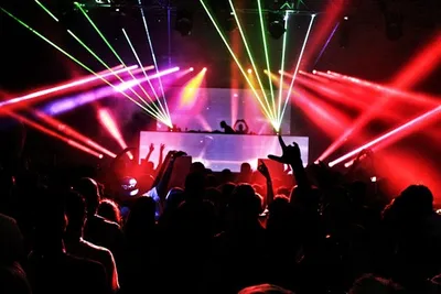
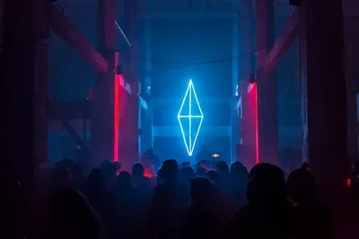
The intensity comes from what sits on top: glowing LED strips, neon signs, laser grids and bursts of violet lightning. Each of those supplies light against darkness, rather than color against color, which is the distinction that matters. The result is moody, futuristic, nocturnal, cyberpunk and retro-synthwave in character.
Which Visual Themes Shape A Dark Neon Purple Aesthetic?
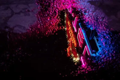
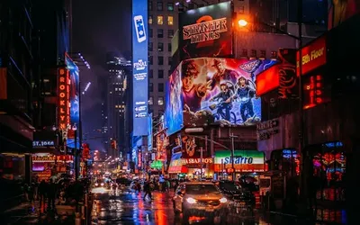
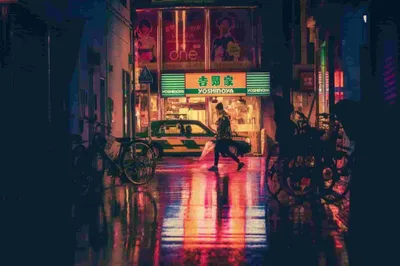
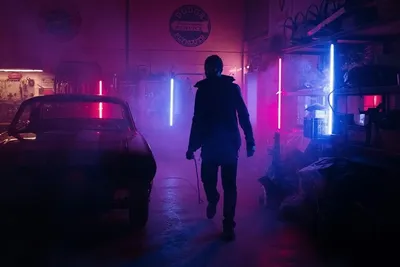
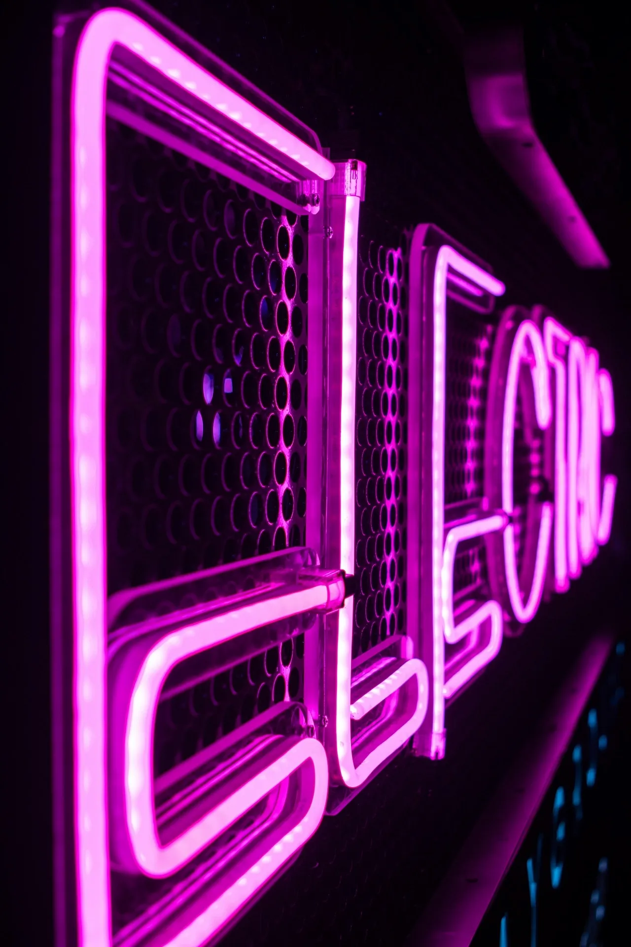
Cyberpunk cities supply the most recognizable imagery: rainy streets, illuminated alleyways, reflective pavement and glowing digital skylines. The wet surfaces matter as much as the lights, because reflection is what doubles the violet and fills the frame.
Cosmic imagery works differently, using purple moons, eclipses, nebulae, galaxies and black holes to create depth rather than density. Gothic and grunge elements bring silhouettes, glitch effects, abstract liquid textures and single-source lighting, and our custom cyberpunk neon signs sit comfortably in any of the three.
What Is Dark Neon Purple?
Dark neon purple is a deep purple foundation lifted by highly saturated, luminous violet or magenta highlights. The two halves are not optional. Darkness and brightness work together, and removing either one removes the electric quality that defines the color.
It is distinct from pastel lavender, soft lilac and ordinary deep purple, none of which carry the same charge. Brightness, saturation and surrounding colors then change how it appears on screens and in physical installations, which is why custom backlit signs demonstrate the principle so clearly.
Screens complicate this further. A violet that looks saturated on an OLED panel can turn muddy on a cheaper display, and the same hue behaves differently again as physical light on a wall. Judge a color on the medium you are actually going to use it in.
What Is Neon Purple Called?
You will see it described as electric purple, vivid violet, ultraviolet, fluorescent purple and electric violet, and the names are used more or less interchangeably despite representing slightly different hues. That looseness causes real problems when ordering.
Check precise color values rather than trusting a descriptive name. There is history behind the confusion, since NIST records that neon gas itself glows red-orange, meaning every purple in traditional neon came from other gases, coatings or tinted glass rather than from neon at all.
Want electric violet light without fragile glass tubing?
Our custom purple neon signs use flexible LED tubing to deliver saturated violet glow in the size, font and backing shape you choose.
What Colors Go With Dark Neon Purple?
Color combinations decide whether purple reads futuristic, dramatic, playful or sophisticated, and the same violet can do all four depending on what surrounds it. Choose supporting colors according to the mood you want and the amount of contrast the space can carry.
The reliable structure is darker neutrals as the foundation and brighter colors as controlled accents, in that proportion rather than the reverse. Testing helps here, and a color wheel tool lets you check complementary and analogous pairings before you buy anything physical.
|
Paired with violet |
Effect |
Best used for |
|
Matte black |
Maximum contrast, dramatic glow |
Gaming rooms, feature walls |
|
Charcoal gray |
Softer drama, less harsh |
Bedrooms, studios |
|
White or silver |
Clean and contemporary |
Offices, modern interiors |
|
Deep indigo |
Nocturnal and atmospheric |
Wallpapers, backdrops |
|
Cyan or turquoise |
Bold cyberpunk contrast |
Streaming setups, arcades |
|
Lime green |
High-energy, harder to control |
Accents only, used sparingly |
What Color Makes Dark Purple Neon Pop?
Black and charcoal give you maximum light-dark contrast and the most dramatic glow, which is why almost every strong example of this aesthetic uses one of them as the base. Nothing else produces the same separation between the lit and unlit parts of a scene.
White and silver create a cleaner, sharper and more contemporary composition, trading some of the drama for legibility. Lime green, cyan and turquoise deliver bold cyberpunk contrast when you want it, and our guide to the brightest neon light colors explains why some of these read stronger than others.
Restraint is the practical rule. Two accent colors are usually the ceiling before the palette stops reading as deliberate, and violet plus one partner covers almost every version of this look. A third accent tends to flatten the contrast the whole aesthetic runs on.
Building a cyberpunk room around one glowing focal point?
Choose custom cyberpunk neon signs designed for dark walls, where deep backgrounds amplify the glow instead of washing it out.
Explore OptionsWhat Aesthetics Use Dark Neon Purple?
Cyberpunk, synthwave, vaporwave, outrun, retro-futurism and futuristic nightlife all draw on dark neon purple. What they share is a combination of darkness, glowing color, technology-inspired imagery and dramatic lighting, applied in different proportions.
What separates them is typography, subject matter and composition rather than the palette itself. Synthwave uses horizon lines and gradients, vaporwave uses statuary and pastel breaks, and outrun uses motion. Dark purple works particularly well for nocturnal styles, and a custom purple neon sign anchors any of them.
How Does Dark Purple Change The Mood Of A Neon Aesthetic?
Darker purple creates mystery, luxury and atmosphere in a way that brighter neon colors do not, because it reads as depth rather than as signal. Black backgrounds and selective lighting push the effect further by leaving most of the scene unresolved.
Depending on what surrounds it, dark purple shifts a composition toward gothic, celestial, futuristic or grunge. Lighter lavender and lilac palettes behave almost oppositely, feeling soft and daylit rather than nocturnal. Our neon interior design themes guide maps these moods to real rooms.
Scale changes the reading as well. A small violet accent in a mostly dark room feels precise and expensive, while the same color across a whole wall feels theatrical. Decide which of those you want before choosing dimensions, because the sign cannot do both at once.
How Can You Choose A Neon Dark Purple Wallpaper?
Dark foundations reduce visual clutter while glowing purple elements create a single strong focal point, which is exactly what a usable wallpaper needs. Busy artwork fails on a desktop no matter how good it looks as a standalone image.
Subjects that work include rainy cities, sports cars, neon tunnels, lightning, planets, abstract waves and illuminated typography. Choose HD or 4K according to your screen resolution and aspect ratio, and check download quality and licensing before use. Our aesthetic neon wallpaper guide covers sourcing in more depth.
Stay specific while you search. Generic purple wallpapers are not the same thing as neon dark purple imagery, and search results mix the two constantly. The distinguishing feature is always a dark base with luminous highlights, not simply a purple color scheme.
Which Neon Purple Aesthetic Wallpapers Work Best For Different Moods?
Bright magenta-violet compositions suit energetic gaming and entertainment setups, where the screen is part of the room lighting rather than a quiet window. High saturation works there because everything around it is already loud.
For calmer desktops, choose restrained violet lighting and generous negative space. Cosmic, urban and abstract subjects produce noticeably different emotional effects even when they share an identical palette, which is worth testing. Physical accents such as glow-in-the-dark stickers extend the theme off the screen.
Need a statement light for a bedroom or gaming setup?
Our custom neon signs for bedrooms run cool and dim low, so a bold violet piece works at night without dominating the room.
How Can You Create A Consistent Neon Dark Purple Wallpaper Theme?
Consistency comes from a limited palette, repeated glow effects and related imagery rather than from using the same picture everywhere. Three images that share a hue family and a lighting style will feel more coherent than three copies of one file.
Coordinate desktop, mobile, lock-screen and application backgrounds without using identical images, since each surface has a different shape and a different amount of interface sitting on top. Vary composition while holding the purple hue family and overall lighting treatment steady.
The failure mode is predictable. Excessive colors or unrelated visual motifs weaken the aesthetic faster than anything else, because the whole look depends on restraint. If a new image introduces a fourth accent color, it usually belongs somewhere other than this theme.
How Can You Make A Purple Neon Wallpaper Easy To Use?
Landscape compositions suit common desktop and laptop aspect ratios, and cropping a portrait image to fit almost always destroys the composition that made it appealing. Start from the right shape rather than correcting it later.
Keep the brightest neon elements away from frequently used icon areas, usually the top left and the dock. Test readability with both light and dark icons, and follow your platform guidance on changing the wallpaper so the file is applied at native resolution rather than scaled.
Have artwork or wording you want glowing in violet?
Make your own neon sign from original text or an uploaded design, and approve a digital proof showing tubing route and dimensions first.
Get startedHow Can Dark Purple Neon Signs Enhance A Room?
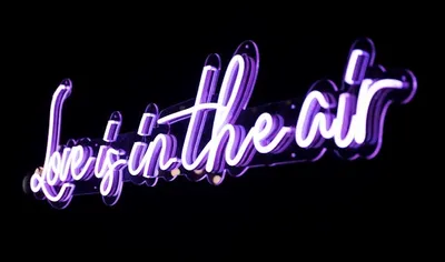
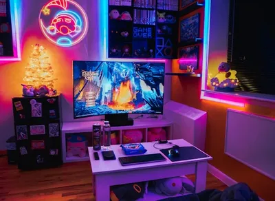
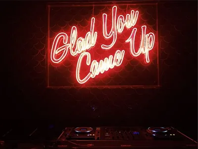
Purple neon signs act as statement lighting and establish a moody focal point in a way that a lamp cannot, because the sign is both the light source and the object being looked at. That dual role is what makes placement matter so much.
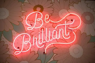
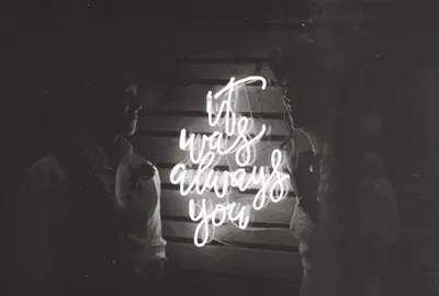
Popular designs include quotes, names, moons, lightning bolts, abstract faces and custom symbols. Bedrooms, gaming rooms, studios, entertainment spaces and creative work areas all suit them. Review brightness controls, dimensions, wall color and power access first, and custom neon signs for bedrooms are built with dimming in mind.
How Should You Choose Purple Neon Designs For Different Spaces?
Match bold designs with gaming and entertainment setups, where high saturation suits the surrounding equipment. Bedrooms and studios take restrained typography and minimalist symbols far better, and larger statement pieces belong on feature walls rather than in corners.
Consider viewing distance, wall space, surrounding lighting and background contrast together, and prioritize readability whenever the sign contains text. Purple sits between red and blue in the spectrum, and research comparing red and blue LED light at night found the blue end notably more disruptive, so specify a dimmer for bedrooms.
Power access decides more installations than taste does. Violet signs are frequently mounted high or in alcoves where the nearest outlet is inconvenient, and a visible trailing cable undoes the effect completely. Plan the route before you choose the position.
How Should You Use Neon Dark Purple In UI Design?
In interface work, neon dark purple belongs on calls to action, active states, highlights and important interactive elements, not spread across the layout. Deep backgrounds amplify its perceived glow, which means you need less of it than you would expect.
Contrast is where this palette usually fails. W3C guidance on text contrast ratios sets the standard, and glow effects around small body text break it reliably. Use restrained animation, clear spacing and consistent hierarchy, and test across different displays before shipping.
How Can You Create A Futuristic Purple Neon UI?
Combine deep purple, black and indigo backgrounds with controlled electric-purple highlights, keeping the accent to a small fraction of the visible area. The futuristic quality comes from restraint and from where the glow appears, not from how much of it there is.
Use glow effects for interactive states and focal elements only, and keep body text highly legible rather than styled. Maintain consistent hue, saturation and glow treatment throughout, because inconsistency across screens is what makes a neon interface look amateur rather than designed.

Frequently Asked Questions About Neon Dark Purple Aesthetic
What Defines A Neon Dark Purple Aesthetic?
It combines deep, shadowy backgrounds with vibrant electric violet, ultraviolet and magenta illumination, producing a moody, futuristic and nocturnal look that depends on darkness as much as on the purple.
What Is Dark Neon Purple?
It is a deep purple foundation lifted by saturated, luminous violet or magenta highlights, distinct from pastel lavender, soft lilac and ordinary deep purple, which lack the electric quality.